Never underestimate what you’re inspired by. I remind myself this on a constant basis, it can be easy to forget. In this inaugural blog about color stylings on the Shelfology website, I’m grateful to share my voice. Fondly, this is a place filled with organizing, super fly design, shelving, hardware and organized living and I’m here for it. We share much in common, both being US brands who showed up to create more connection to manufacturing and better accessibility to it all for both the design & consumer worlds. That’s an understatement in and of itself, but it’s at the core of our everyday operations and where the intersection of why a Minneapolis maker is on the blog of an Idaho manufacturer.
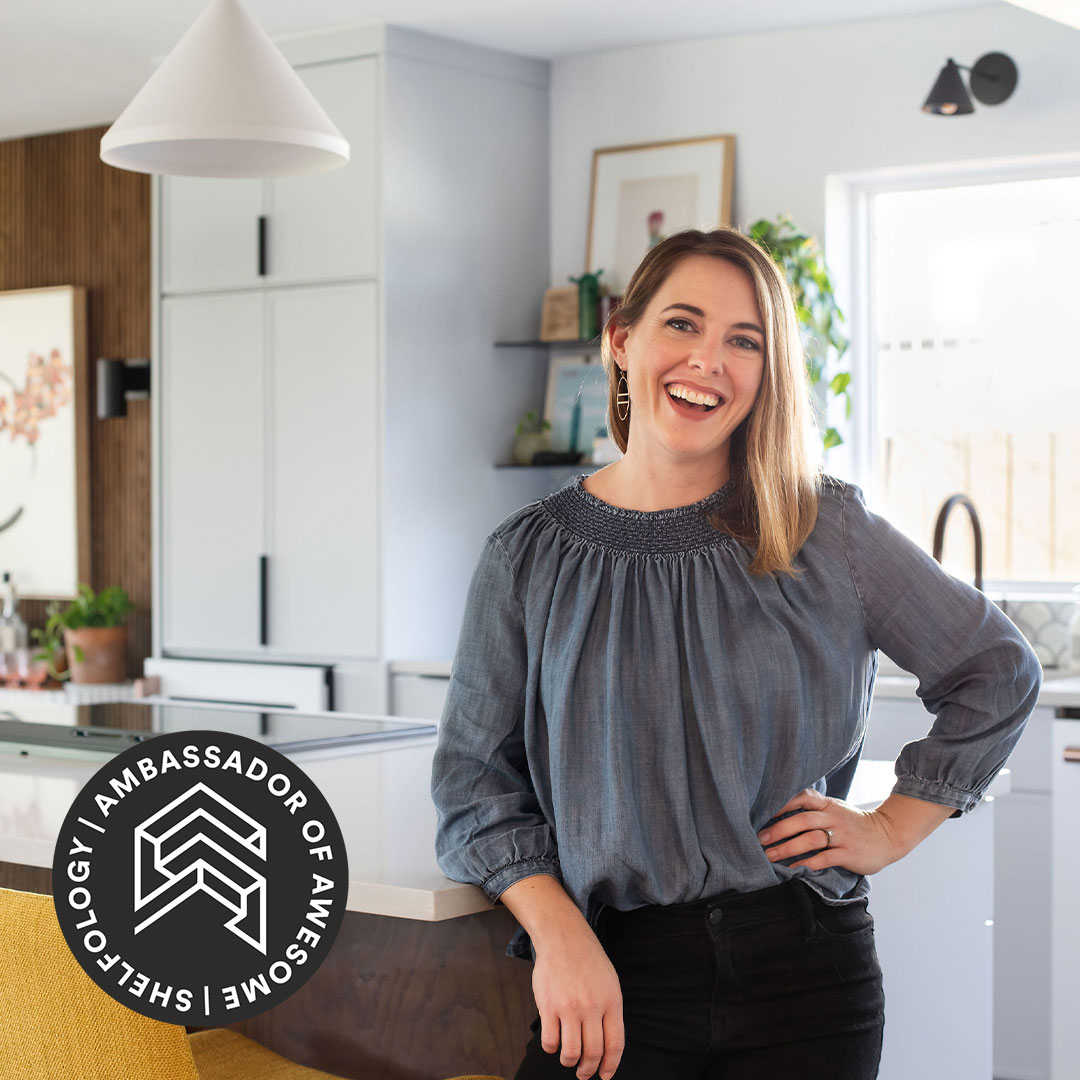
First, an introduction is in order—I’m Mercedes Austin—born an artist and color-loving misfit from day one. I grew up in a Victorian home that was adorned with the interior stylings of a rebellious artist, so think exquisite hardwood floors, original light fixtures, ornate stained-glass windows, and my room would be filled with bright red & orange hexagon wallpaper sprinkled with uniquely illustrated animals within the shapes. I fondly remember being this toddler talking to the animals on my walls in their hexagon environments. Later in life, my rebellious artist mom started playing by the rules and the bold colored wallpaper and high-lacquered modern furniture would slowly but surely exit our home for a traditional Victorian look. By this time, I’d lost any interest in being at home for any length of time; I was always on the move, learning something new. It was in my teenage years that I would discover ceramics and start to think of myself as more than an artist. I became intensely interested in building and making things.
Fast forward to today, I picked up on what I love to make, turned it into a day job, and later grew that into an industrial version of an artist’s studio where three dozen artisans bring geometric patterns to life through our craft. The style that I did the thing was very steady, extremely bootstrapped, and went through about five business models to land where we are now—it’s that classic [adage], “If at first you don’t succeed, try-try-again.” It’s also where my personal motto “Never Give Up” comes from. I literally also remind myself of this often.
The style that we make tile adopts the artist rebel I greatly admired in my mom in the way we work and show up in the tile industry. The fun part of it is there are more of us out there; it was lonely for a bit in our first 15 years, but now that the industry has begun to adopt and embrace color in ceramic tile, we’ve got a lot more members of this budding community. At Mercury Mosaics, we’re a fusion of industrial designers, creative rebels, sustainable champions, and ceramicists through an ongoing learning process.
This is what led me to fall in love with fellow industrial designers and rebels over at Shelfology. When we were building our dream design studio and specifying brands and materials we admired, it was important to source finishes and feels that related to our vintage industrial space, while having that fresh, colorful, well-made rebel spirit.
Having a space to work in-person with clients and really have our fingers on the pulse of color has been an absolute pleasure. I plan to highlight some of the classics I see trending and some new, refreshing directions color is taking in our living spaces. Enjoy and know that, at the end of the day, color is personal. The perfect combo of colors, materials, and hues set the mood and have the power to transform any space from being just a room to somewhere you enjoy investing your time and recharging. I highly recommend paying attention and learning for yourself what speaks to you and embracing it. What would your life look like if your spaces were a reflection of you?
Predictions of things we’ll see in the upcoming year:
Moody Colors

I’m here for this. In my early career, I was warned about using color in general. For fellow rebels and me, you know what’ll happen if you tell us not to do something—we’ll do it anyway. I’m a firm believer in using things that work against a vision I have in a positive light, and I like to call it upcycling the naysayers. Wildly, when things come to life in the mainstream, those same people telling you that color depresses the resale value of homes are the ones later interviewing you for the trends and listing you off as an amenity. My point here is there’s so many opinions out there. You have to have a strong sense of direction and be relentless to make it happen. On the flip side, everything expressed here is simply my opinion and may not fit with your vision of what you see. At the end of the day, I want to co-exist and grow respect for my industry and my peers, so I’ll never fight or bicker with these opposing views but take note and use them in that fuel we creative rebels use. If you know, you know. In 2023, we are designing with deep moody colors in spaces that have strategic pops of color most often in the form of hardware, lighting, or wallpaper.
Earth Tones

Terra cottas and greens are showing up in droves. I’m surprised these tones weren’t commanding attention ten years ago, but if there’s one thing I am – it’s patient. I mean, imagine you’re out in nature, where you recharge and become centered. (I’m speaking to my non-city friends here). This feeling of being at one with nature is something so many of us are searching for in our interior spaces. At the very least, we’ve brought in and kept alive a number of house plants, and this is taking that feel to the next level. We’re talking a more permanent building material-level. It’s not unusual to hear our clients seeking emerald tones harkening an exploratory trip filled with epic hikes or simply a reminder of this yurt they’d just recently Airbnb’d at for the weekend. Color tells a story and, curated intentionally, it can tell you a story you’d enjoy reading and rereading on the daily. Earth tones are absolutely colors, which are trending now, but have proven to be timeless across genres—so don’t worry as much about being on-trend and invest time in learning which hues fill you with happiness.
Natural Woods

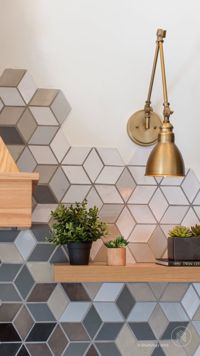
Natural woods are making a big comeback, especially in shelving and even as a wall-cladding material. We’re seeing a lot of our tile paired with Shelfology’s classic wood tones. Notice how a classic black and white color palette pairs almost as seamlessly as a moody blue color palette.
Pops of Color


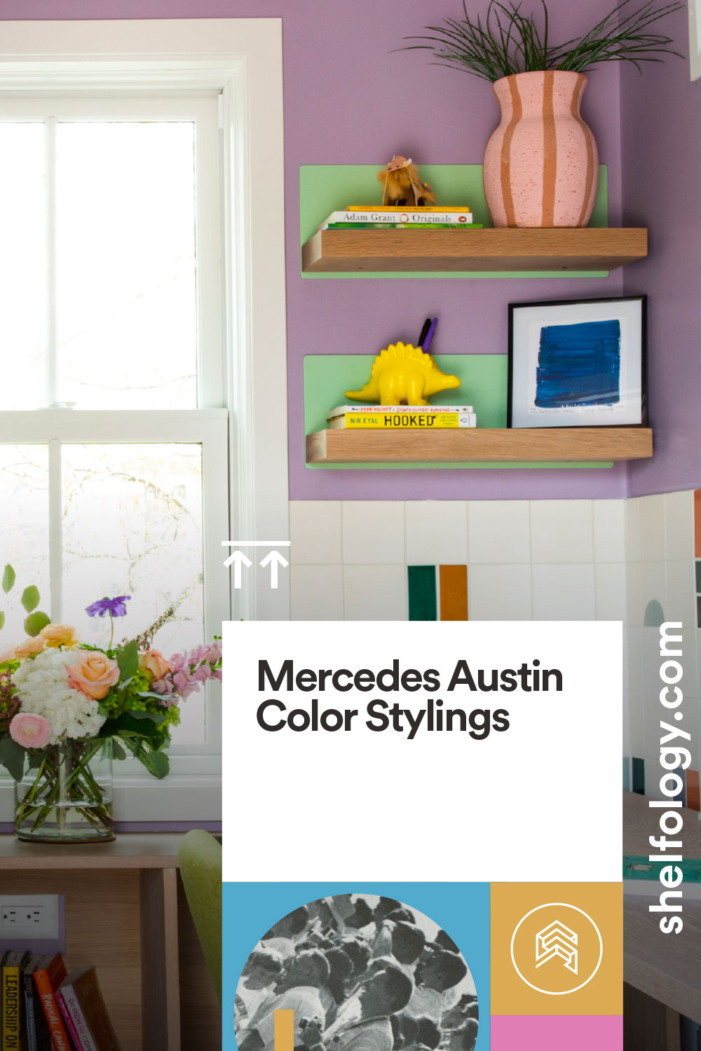
One final prediction we’re seeing is freedom with pops of color. Small spaces are the lowest hanging fruit for people to experiment with this in their own homes and for the rebels out there, well… they’re just going for it. I sense that just going for it is going to become more and more leaned into. Shelfology makes this an easy one to implement with your favorite hue paired with their Skaksel Floating Shelf line. Pops of color bring out the kid in you, and this is a refreshing evolution in this moment. After the pandemic, we’ve been spending so much more time at home; this has ignited a different dynamic for a space once used less frequently to something that needs to work hard. Life is short and color gives life.

Mercedes Austin of Mercury Mosaics
“Working with my hands saved my life,” says Mercedes Austin, CEO of Mercury Mosaics. “There’s something therapeutic about working with your hands, and it’s what centers me. It’s the only way I’ve learned to navigate life and do something that adds value to the world. Returning to the trade is the constant thread.”
Mercury Mosaics is female-founded, artisan-run, & Midwest-made. We’re built from an artist’s vision to uplift the world, one handmade tile at a time. Over the past 20+ years, this has translated to countless collaborations with a community of brands, entrepreneurs, design lovers, visionaries, and your neighbor next door. At this stage of the game, it’s more than tile, it’s a movement!


