

Ambassador of Awesome, Mercedes Austin, fearless leader of Mercury Mosaics, walks us through her “It’s Poppin’” Project. She tackled a small office space with Erinn Farrell Design & Alex Steinman, gurus of intentional workspaces, and the results will have you thinking of putting color and fun into function in your small home office space.
Give a brief project overview; who was involved, and what you were brought in to do in the space. Who were the key players in the design?
The key players in this project were the homeowner, Alex West Steinman, Co-Founder & CEO at the Coven, & Erinn Farrell, Co-Founder + Partner at the Coven, additionally Founder + Principal at Erinn Farrell Design. Custom built-ins were done by the family of the homeowner.


I was brought in to layer color into the already amazing space that Erinn designed. Choosing color for the office of one of my favorite Founders was a breeze. I was inspired by the vibrant and energetic color palette Alex & her designer Erinn had chosen, aptly named ‘Poppin’. Their bold and playful selection set the tone to bring in our Mid Mod Squares. They’re this perfect blend of classic square tiles, sprinkled with signature rounds & dashes of color for a thoughtful & fresh expression. I knew the homeowner is a creative risk-taker and was not afraid of color. This vibe, along with Erinn’s trust in me, really set the tone to use my tile like a box of crayons – the big box of crayons – and choose colors you wouldn’t normally expect in tile. That was really the thing leading this space for me was to redefine one’s expectations of what tile is and how it can transform, elevate, and enhance spaces. The home office isn’t a traditional space you’d expect to find tile, which is exactly why a trio of rule-breakers like Alex, Erinn & I sought to add it into the space.

Tell us about the products selected for the space. What were their functions, and why were they chosen?

Products selected for the space were the following:
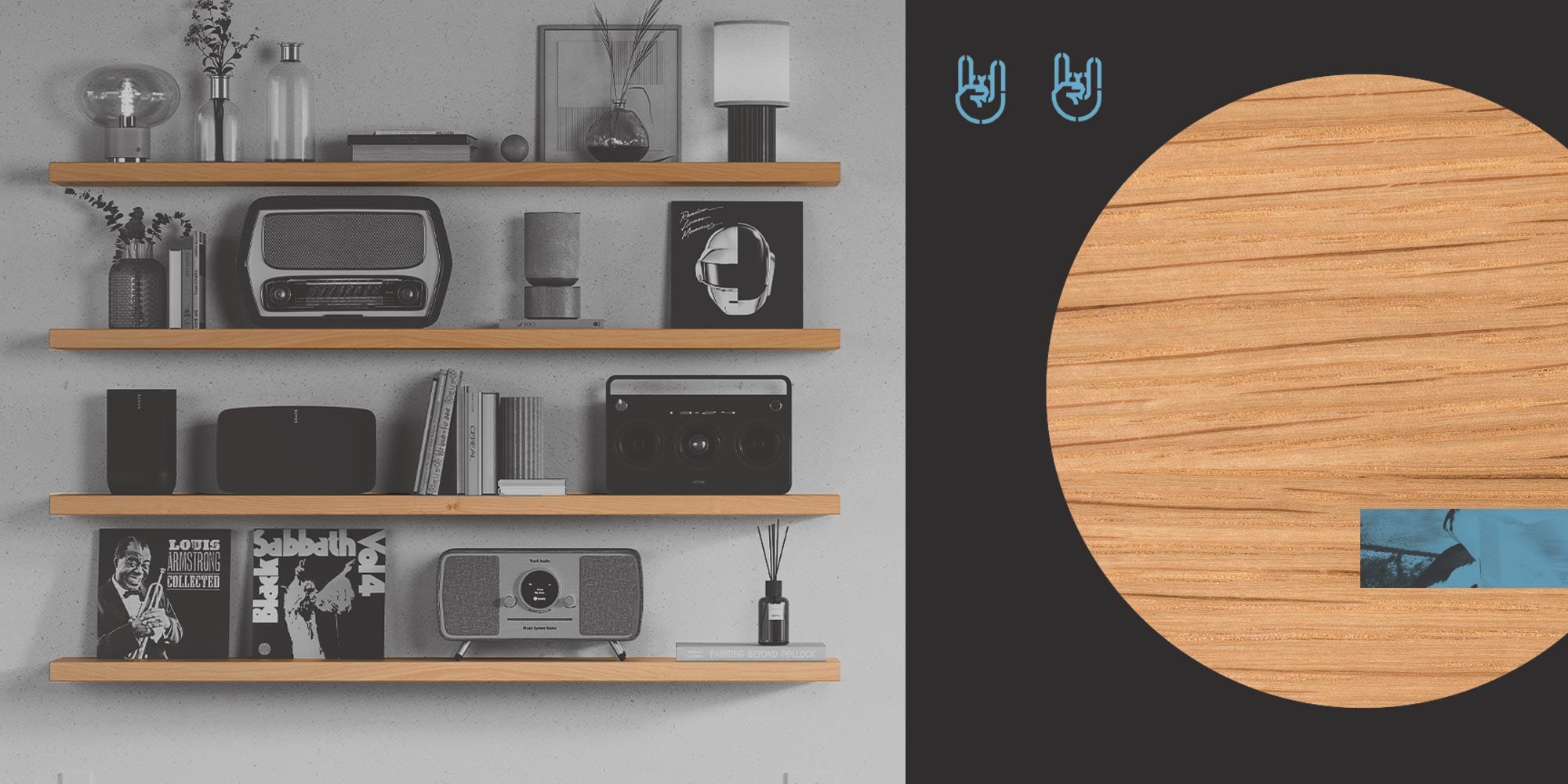
- Skaksel White Oak Floating Shelf by Shelfology; Color: Minty Breath; size 20” wide by 6” deep
- Mid Mod Squares handmade ceramic tile by Mercury Mosaics

We aimed to create a custom color palette incorporating warm & cool tones + a mix of finishes.
Erinn’s suggestion was to put 2 Skaksel white oak floating shelves in Minty Breath to the right of the window. This would maximize space since the longer wall will eventually have a monitor hung & also allows the tile to SHINE. The minty shelf color picks up on some of the tile tones, bringing visual harmony to the whole area.
We chose our Mid Mod Squares pattern because it allows you to pack in a lot of colors without being overly busy. The whole vibe of the home is Poppin’, so the tile had to capture that essence. The homeowner uses the space for flexible working; she’s building an empire, parenting, and is a serial learner, so the space had to work triple hard for this dynamic human!
Small spaces are the best spots to go BOLD. For our little pocket office, we infused color, joy, functionality, and delight in every corner. Mercury Mosaics’ custom Mid Mod Squares design provided a brilliant backdrop for the homeowners to get serious work done while keeping a sense of humor; and Shelfology saved the day with the perfect mint shelves to display items—both were pieces of art in themselves. The Lavender and Mint color palette allowed the neutrals in the room to pop and lent itself a light and playful feeling.–Erinn Farrell
Did you achieve your goals in this space? Which features did you end up loving most?
One of my goals in the space was to showcase that tile isn’t just for kitchens and bathrooms. I feel we accomplished this through our thoughtful pattern and color palette selections. Through using our Marshmallow glaze as the primary tile, with its Satiny-matte finish, it isn’t giving off that bold gloss you’d normally expect from tile. This also makes all the color pops we selected work that much harder and be much more dynamic in small moments. The textures in the space play well with one another, from the natural wood of the custom desk and built-in bookcase to the white oak floating shelf incorporating a pop of color in solid steel. There’s a strong foundation of core elements that invite the homeowner to flexibly layer in her art on the gallery wall and have easy-to-style shelves adjacent to her desk, keeping her power office fresh.
What I ended up loving in the space the most was the color story from the mix of materials. There’s a lot going on and because of the genius of the designer, it all works in harmony. The unifying element is undeniably color, which is at the heart of this home… it’s poppin’. I don’t think it hurts that the homeowner and designer are best friends; you can absolutely feel the heart that went into this project with every detail well cared for.
Have nothing in your houses that you do not know to be useful or believe to be beautiful.–William Morris
Get this look:
-
Skaksel White Oak Floating Shelf by Shelfology
-
Mid-Mod Squares by Mercury Mosaics

Mercedes Austin of Mercury Mosaics
“Working with my hands saved my life,” says Mercedes Austin, CEO of Mercury Mosaics. “There’s something therapeutic about working with your hands, and it’s what centers me. It’s the only way I’ve learned to navigate life and do something that adds value to the world. Returning to the trade is the constant thread.”
Mercury Mosaics is female-founded, artisan-run & Midwest-made. We’re built from an artist’s vision to uplift the world, one handmade tile at a time. Over the past 20+ years, this has translated to countless collaborations with a community of brands, entrepreneurs, design lovers, visionaries, and your neighbor next door. At this stage of the game, it’s more than tile, it’s a movement!


Share:
Hartwick Street Remodel: Lyndsy + Noah + Renovate 108
YOWIE Hotel: An Eclectic Mix of Cozy Styles